Solar System: A Futuristic Display Font for Digital Branding
It started with a hero section that felt… quiet. I was redesigning a landing page for a creative coaching brand—clean, intentional, deeply human—but the headline just sat there. No energy. No lift. So I swapped in Solar System, typed “Clarity Begins Here,” and watched the whole layout exhale. Suddenly, the space between letters wasn’t empty—it was atmospheric. The wide monoline structure held weight without heaviness, and the subtle cosmic elegance gave the page a quiet confidence I hadn’t planned for.
What Solar System Brings to the Screen
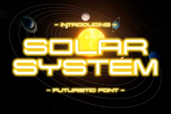
Solar System is a display font—designed not for paragraphs, but for presence. Its inspiration is unmistakable: the scale, stillness, and precision of deep space. But it doesn’t lean into sci-fi clichés. Instead, it delivers a refined, almost architectural monoline style—consistent stroke width, generous x-height, open counters, and balanced proportions. It feels futuristic because it’s uncluttered, not because it’s flashy. That makes it unusually versatile for digital branding: it reads as both elevated and approachable, modern but never cold.
How It Performs in Real Layouts
I tested Solar System across three key areas: hero headers, section titles, and branded accent elements. On desktop, it shines at 48–72px—especially over soft gradient or muted image backgrounds. The letterforms hold clarity even when overlaid on texture, thanks to strong internal spacing and generous letterfit. On mobile? I kept it at 36px minimum with tight tracking adjustments—and it remained legible, though I avoided using it below 28px (where the monoline rhythm starts to blur on lower-DPI screens).
One surprise was its performance in dark mode. Many display fonts lose definition against dark backgrounds, but Solar System’s even weight and high contrast made it pop cleanly—even at 40px on charcoal. I used it for a “Join the Waitlist” CTA button on a course sales page, and it created instant visual hierarchy without shouting.
Where It Works Best (and Where to Pause)
Solar System excels where impact matters more than density:
- Hero headlines — especially on portfolio sites, boutique online stores, and creative service landing pages
- Section dividers — like “Our Approach” or “What Clients Say” on coaching or design agency sites
- Branded accents — logo lockups (as secondary text), testimonial quotes, limited-edition campaign banners
- Digital brand kits — as the primary display typeface paired with a neutral sans serif for body copy
It’s intentionally *not* built for long-form reading. I tried it for blog post titles (great) and then for pull quotes (still great)—but switched immediately when testing paragraph text. Even at 18px, the lack of serifs and minimal stroke variation reduced scanning speed and increased eye fatigue. Likewise, avoid it for navigation menus, form labels, or dashboard UI elements where functional clarity trumps stylistic flair.
Pairing It Thoughtfully
The magic of Solar System isn’t in standing alone—it’s in how gracefully it partners with other voices. I paired it consistently with Inter (a highly legible, open-source sans serif) for body text, captions, and interface labels. The contrast works beautifully: Solar System brings personality and pause; Inter delivers flow and function. For a more editorial feel—say, on a writer’s portfolio—I swapped in a light-weight serif like IBM Plex Serif for subheads, letting Solar System anchor only the boldest moments.
If you’re building a digital brand kit, consider reserving Solar System for your most intentional moments: the first thing visitors see, the emotional punctuation in your story, the signature touch in your email headers or social banners. Use it like lighting—not ambient, but spotlight.
Practical Considerations Before You Deploy
Before adding Solar System to your next project, check three things:
- Webfont support — confirm the vendor provides WOFF2 files and clear loading guidance. I used it via self-hosting with a simple
@font-facedeclaration and saw no FOIT or FOUT issues when optimized. - Weight availability — the standard release includes one clean, confident weight. That’s perfect for display use, but know there’s no bold or light variant to fall back on for hierarchy within the family itself.
- Licensing for digital use — verify commercial web licensing covers your use case, especially if embedding in client sites, SaaS dashboards, or downloadable templates. Most reputable vendors include this, but always double-check.
Also worth noting: while Solar System includes basic Latin characters and common punctuation, it doesn’t support extended diacritics or Cyrillic. Perfect for English-first brands, but plan accordingly if your audience spans multilingual markets.
A Font That Elevates Without Overcomplicating
What makes Solar System special isn’t just how it looks—it’s how it behaves in context. It doesn’t compete with your content. It doesn’t distract from your message. Instead, it frames it with quiet authority. In a landscape full of decorative fonts that shout or swirl or mimic handwriting, Solar System offers something rarer: sophistication with simplicity, futurism with warmth, impact with restraint.
It won’t fix weak copy or poor UX—but when your words are clear and your intent is intentional, Solar System helps them land with grace. And in digital design, where attention is scarce and first impressions are everything, that kind of quiet power is exactly what many brands have been orbiting toward.